The de-facto Flatpak app store for Linux that every other post on this site seems to mention is getting a visual update, with its currently styling described as “dated”.
More details on the rebrand are shared in post on his blog by prominent GNOME designer Jakub Steiner, which features this short animation to provide the “ta-dah!” moment:
Fancy, isn’t it?
In the accompany blog post, Jakub Steiner explains a bit more about the new brand:
“[The rebrand] centers around the core of what Flathub is — the apps themselves. The identity isn’t very loud and shouty. The flashy colors and emphasis remains on the apps themselves, Flathub is the neutral platform for the apps to shine.”
Looking at the logo, that concept clicks firmly into place. The new logo is a better presentation of what Flathub is, what it offers, and what it represents.
I know from my own efforts at creating (not awfully inspired) logos for my blogs that reigning things in, keeping things simple, understated, and un-fussy is often more challenging than caving in to chuck every color, cliche, and convention at the canvas.
Thus, my appreciation for the new logo all the greater. Not only does it pull of being a simple design but also a very effective one. My favourite element is the “+” as it says “more” (for users, there’s always more apps) and “add” (for devs, you can add your app to this store).
Talking of developers, check out the new “download badges” that app makers can use to promote their wares on websites, project pages, and the like:
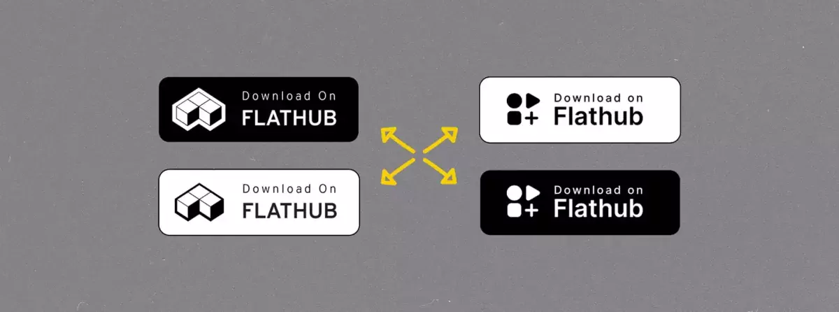
Classy. Modern. Playful.
If you’re wondering where the rounded square, triangle, and circle come from, I assume they’re a nod to the design of the GNOME Software icon, which uses the same set of symbols:

Flathub’s new look is not live on the main site yet but the beta.flathub.org site is already sporting it. Design guidelines for the revamp, as well as SVG assets that can be used to promote it, can be acquired from Jakub’s blog post.
